
Color Swatching
Welcome to the Artists’ Field Guide! This is where I’ll occasionally share resources I think are helpful for artists of many backgrounds. Like my other blog posts, they are not updated on a regular schedule, so if you want to get notified when the next one goes up, be sure to subscribe to my newsletter!
Please note that nothing in this post is sponsored, and there are no affiliate links or anything.
What’s the nonbinary way of saying, “I’m a mixed media girly?” Whatever it is, that’s what I am when it comes to traditional art supplies! If you’ve been around for a while, you’ll remember that I was a strictly pen and ink artist for a while, then I delved into watercolors, gouache, ink, and colored pencils for a bit before deciding to dive into digital (because I could finally afford a tablet lol).
Well, recently, I’ve been really missing that tactile sensation in my artwork and decided it’s time to merge the two worlds together. I talk a bit more about this decision in my newsletter Issue #42, but essentially, I’ve decided to create the line art for my work digitally (because that’s the part that I feel most precious about lol), print it out, and paint it. For comics, that’ll be followed by scanning and touching up the art, then lettering it digitally.
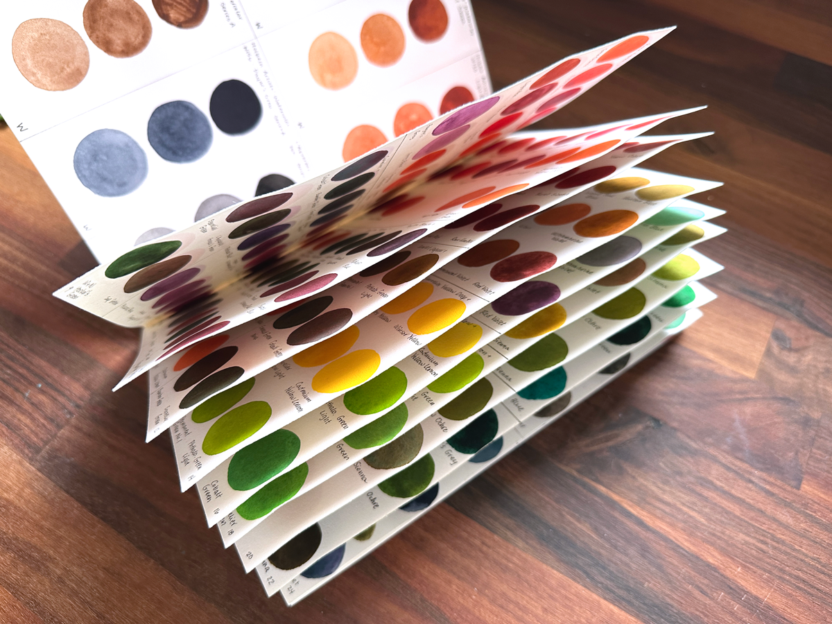
In order to get reacquainted with my supplies, I decided to create a few swatch books for them using my preferred paper: Arches Hot Press Watercolor Paper. I made a couple of booklets by saddle-stitching them with 100% cotton thread, following this tutorial from Sea Lemon on Youtube. I know they suggest not knotting the end of your thread, but I found that knotting it helped me to keep it from falling out constantly if I pulled it too hard in the beginning as I flipped the pages back and forth lol.
But First, A Note!
Please keep in mind that these were collected over the span of many years, so if you’re just starting out getting your own supplies, don’t feel pressured to go out and get this many!! I also got many of them on sale and encourage you to wait for discounts to grab yours, too. I have received some gift cards from friends over the years, too, that went toward some of these supplies, and I once even won a $125 gift card from Blick!
Blick has consistently been the more affordable place for year-round shopping for me personally, but I’ve also gotten a lot of supplies with coupons at Michaels. And while it always makes me sad when an art supply store goes out of business, that’s a great time to pick up some deeply discounted supplies, too. Another place I get some of my supplies from is JetPens (especially for Zebra Mildliners) since they have a wider range of colors for some supplies, but they’re a smidge more expensive most of the time.
You can find a text list of my colors at the end of this post. One final note on the shorthand I’ve used on the pages before we get to the swatches:
- W = Watercolor
- G = Gouache
- WP = Wax Pastel
- CP = Colored Pencil
- ZM = Zebra Mildliners
Watercolors
Let’s start with watercolors!
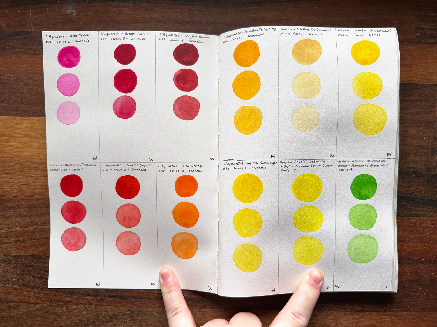
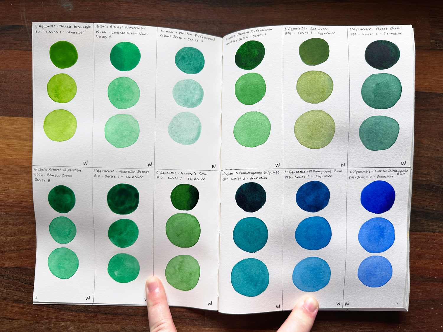
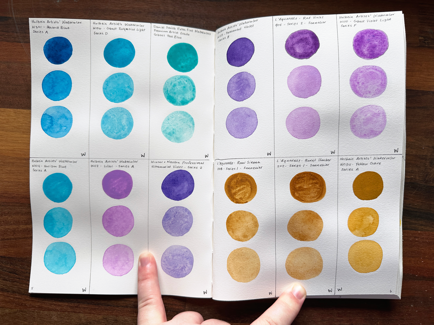
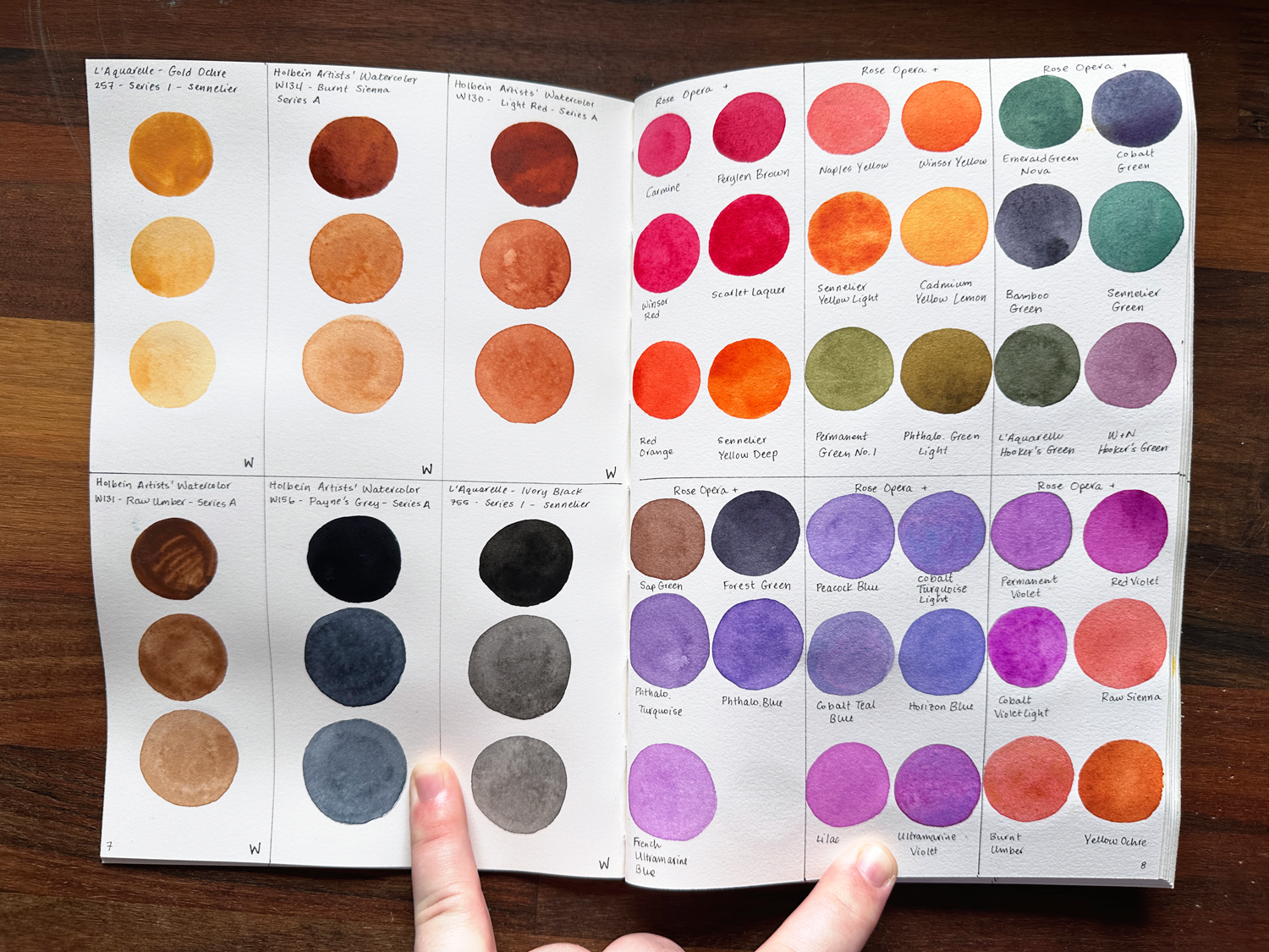
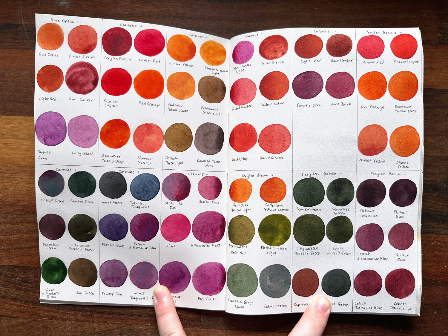
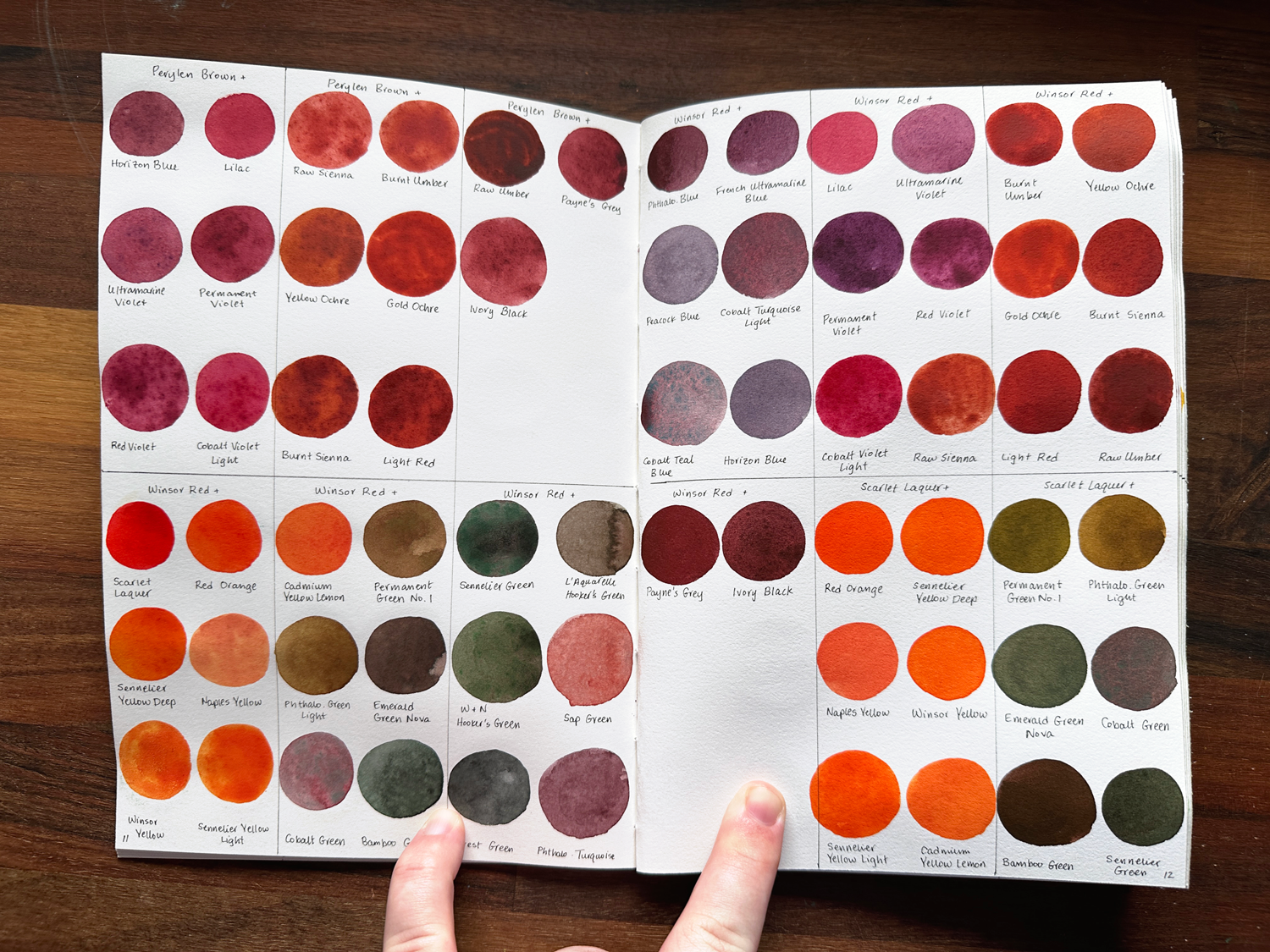
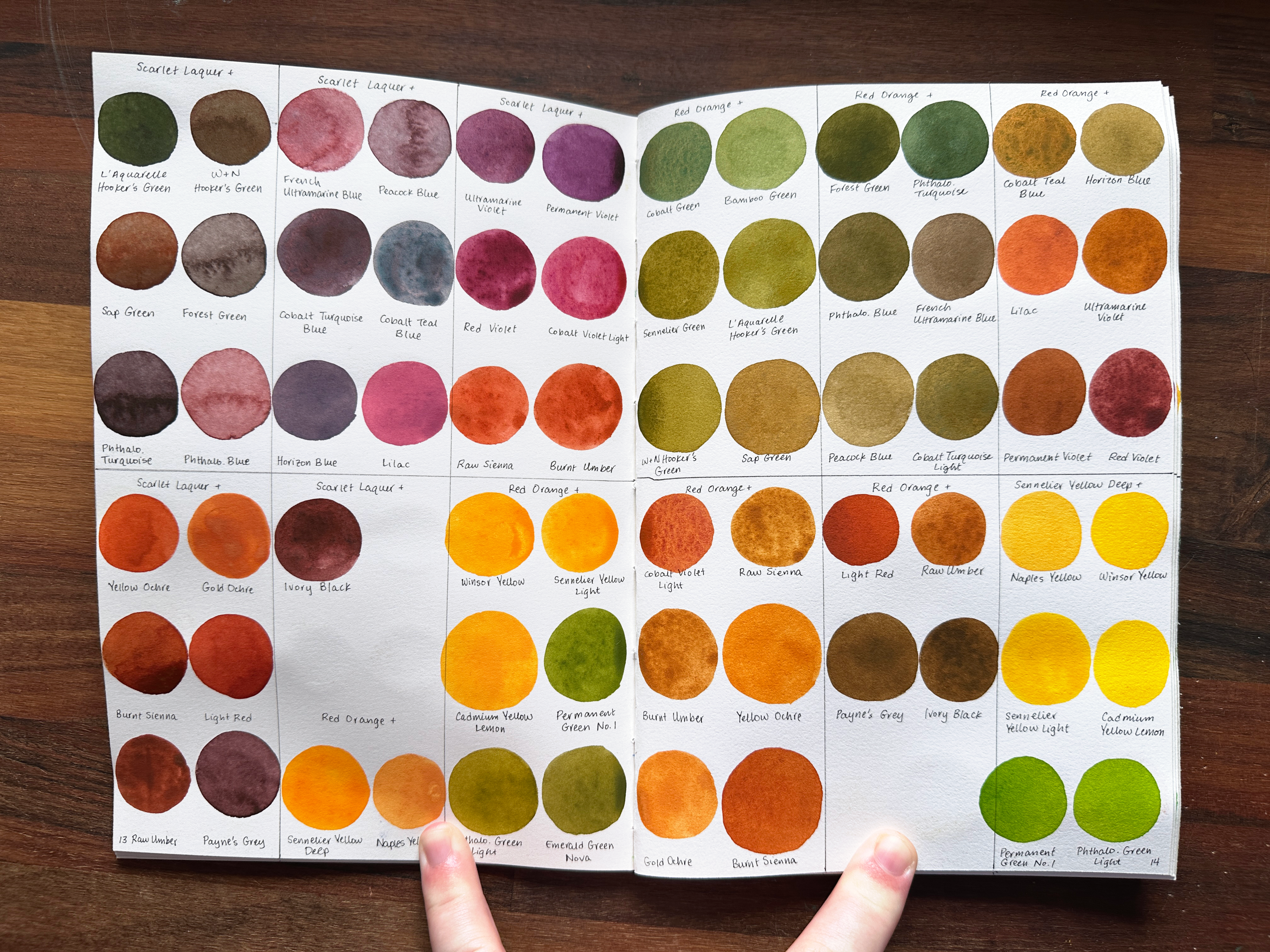
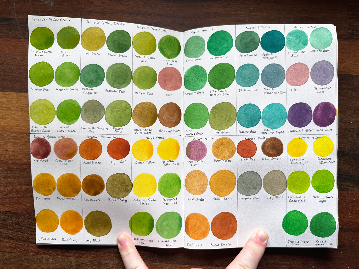
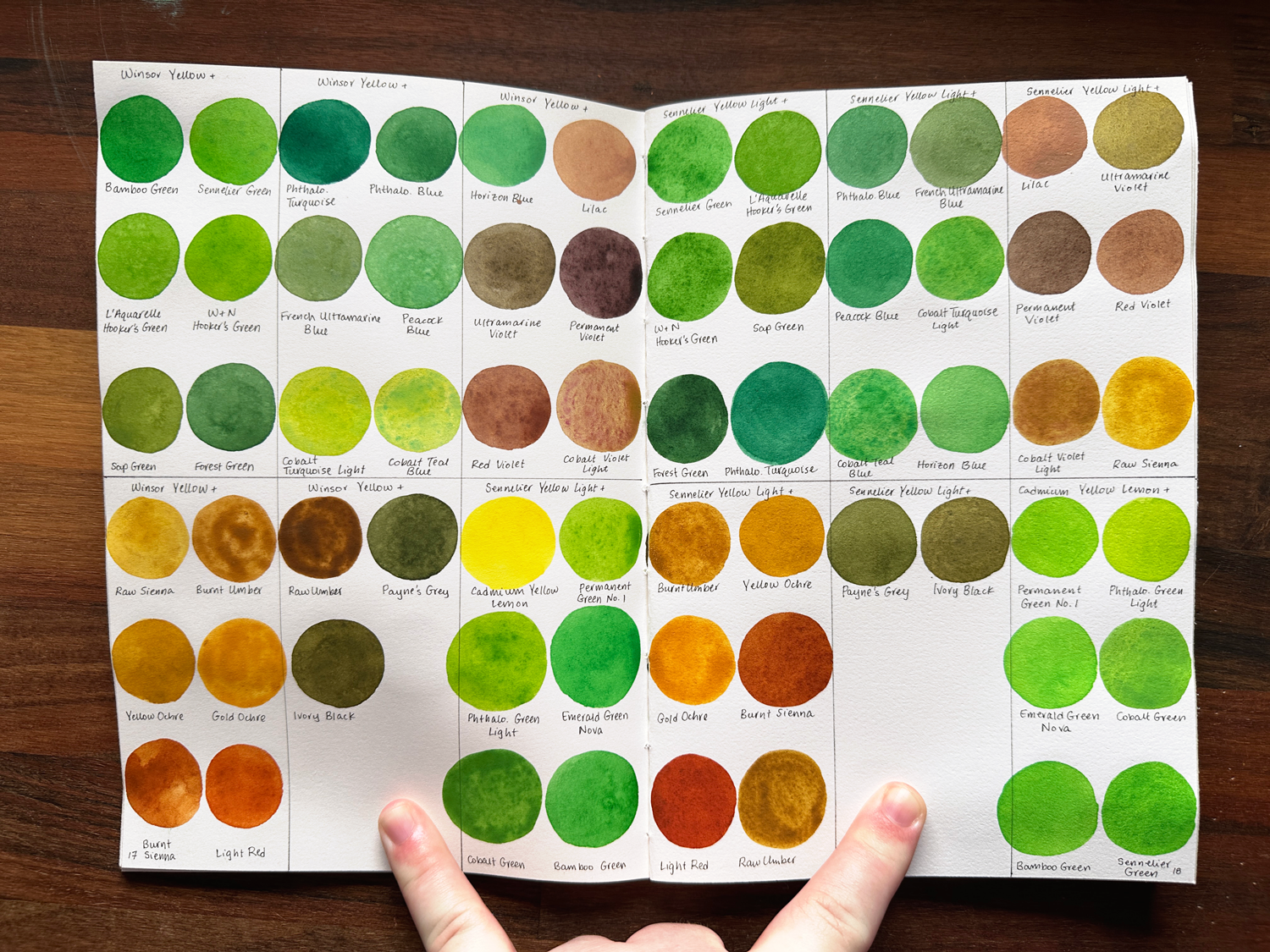
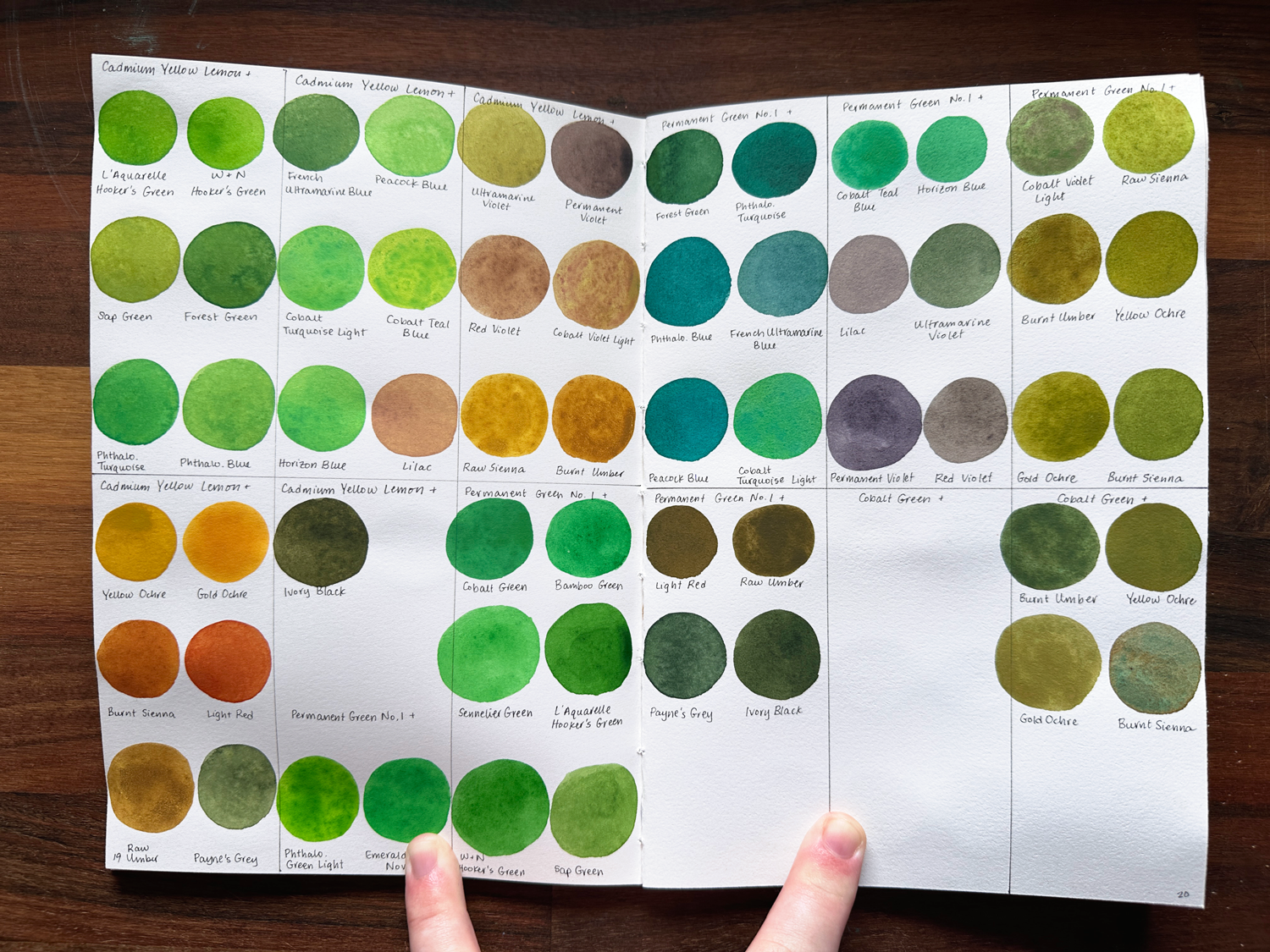
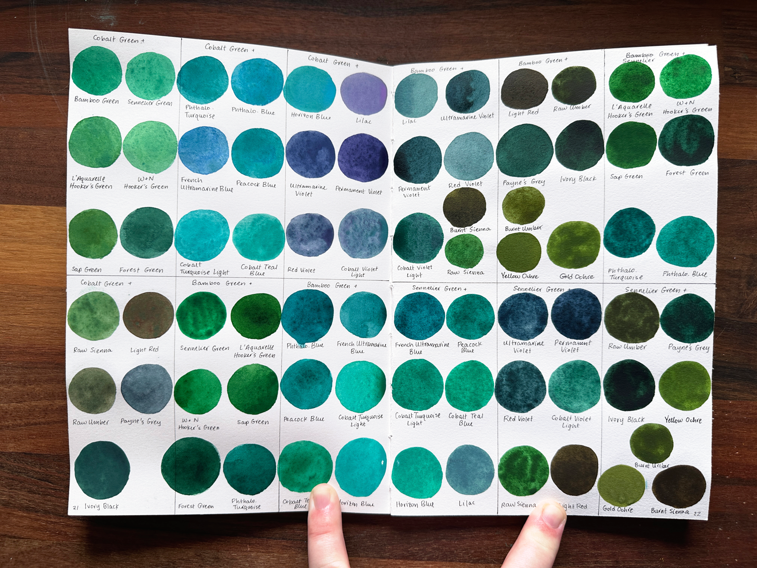
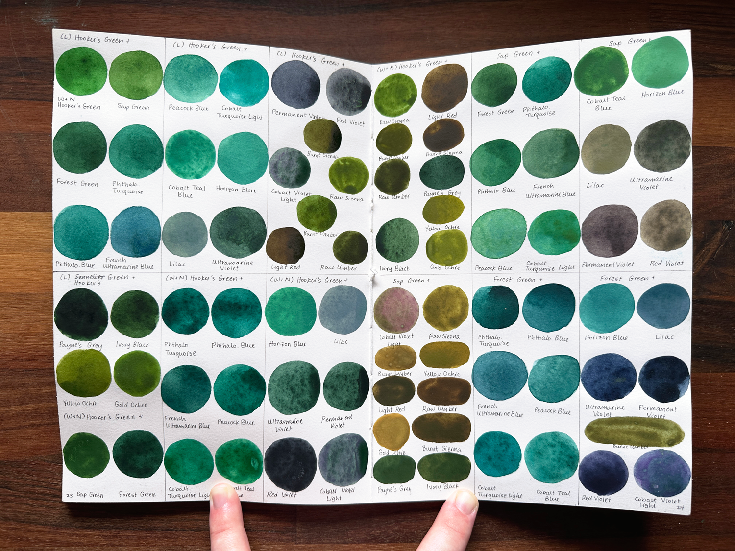
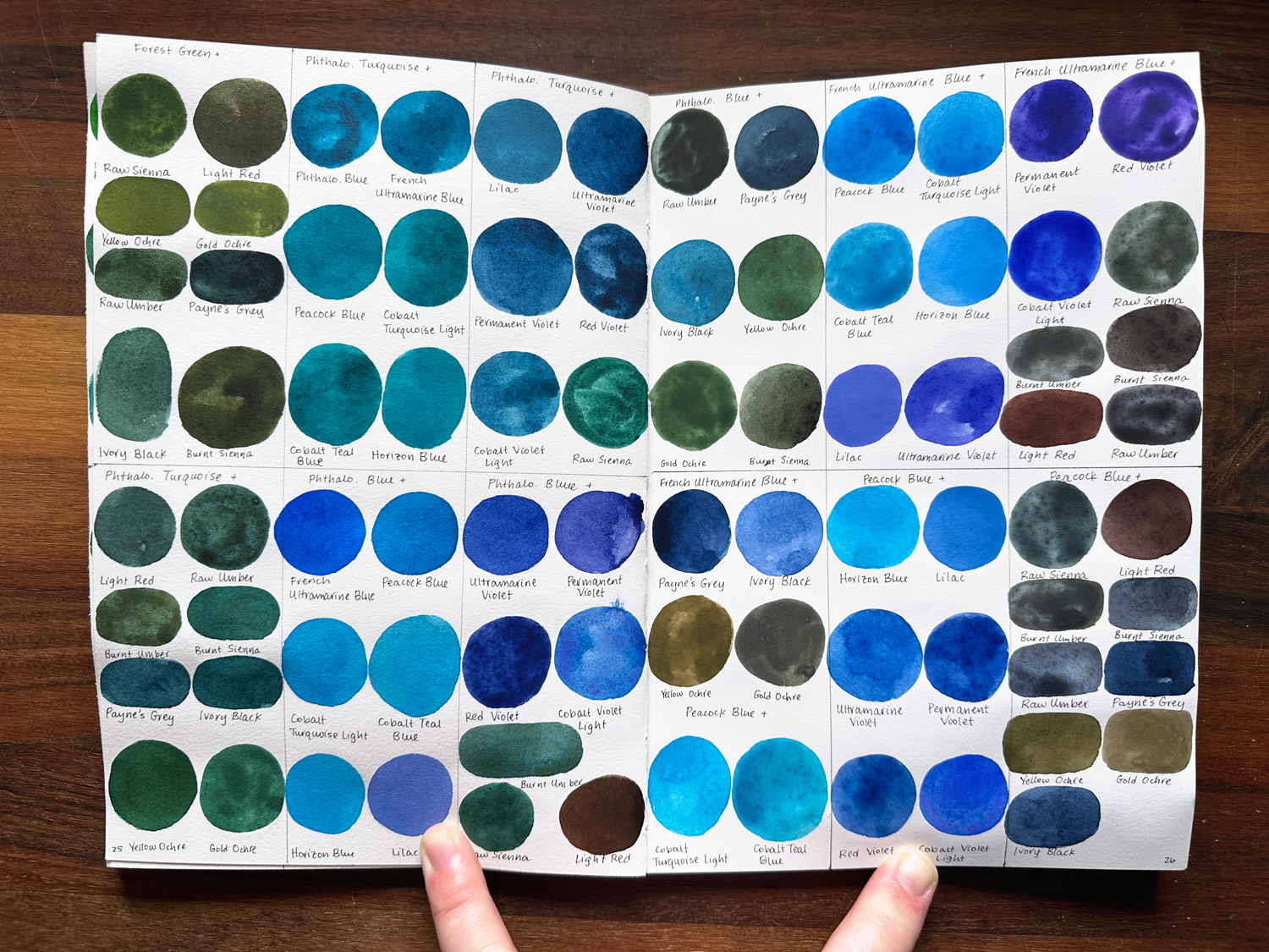
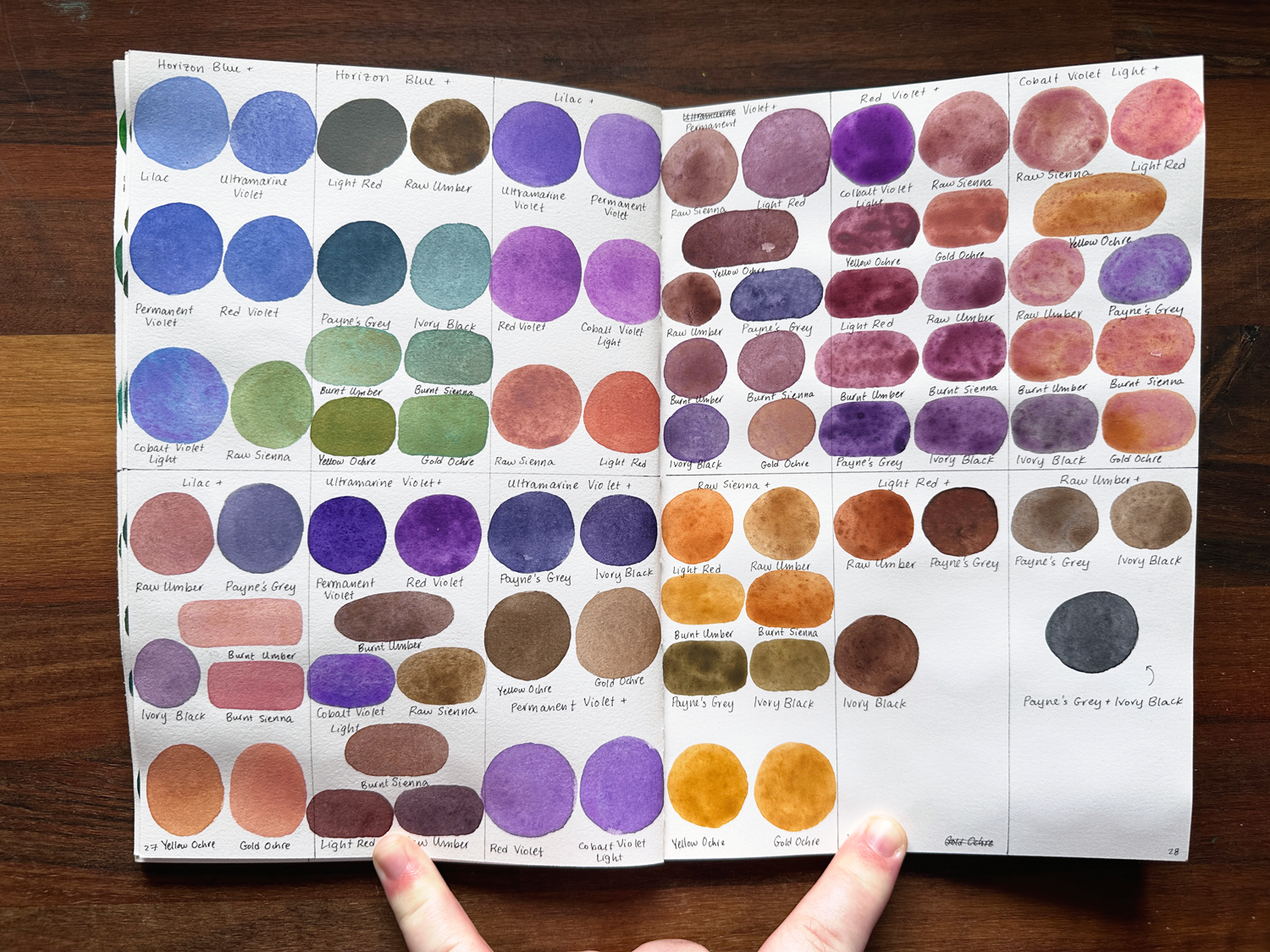
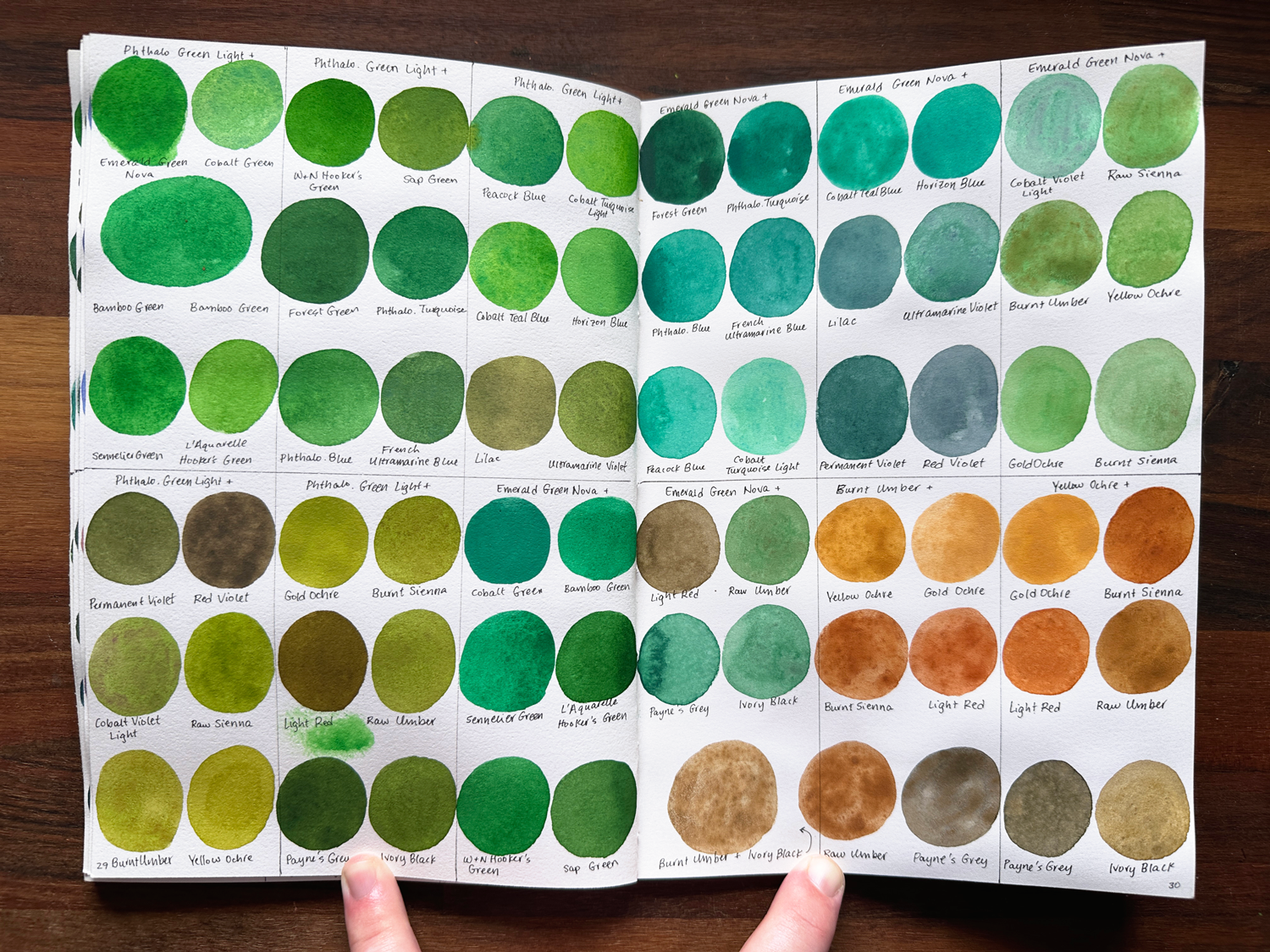
I love painting with watercolors, and lately, I especially love it for using them as an underpainting to gouache in my mixed media paintings, leaving little spots here and there bare of gouache to let the light from that watercolor shine through. For the swatch book, I swatched the colors individually, then combined them with the other watercolors I have, too.
For the individual colors, I swatched these by using three drops of water to get the paint started, then added another three drops of water to get the second swatch, and finally, another three drops to get the final swatch. For the combined colors, I did just the three initial drops for a single swatch of each combination.
I have the full list of the brands and colors I use both written on each image and listed at the end of this post, but my main brands used are Sennelier L’Aquarelle Watercolors, Holbein Artists Watercolors, and Winsor & Newton Professional Watercolors.
Gouache
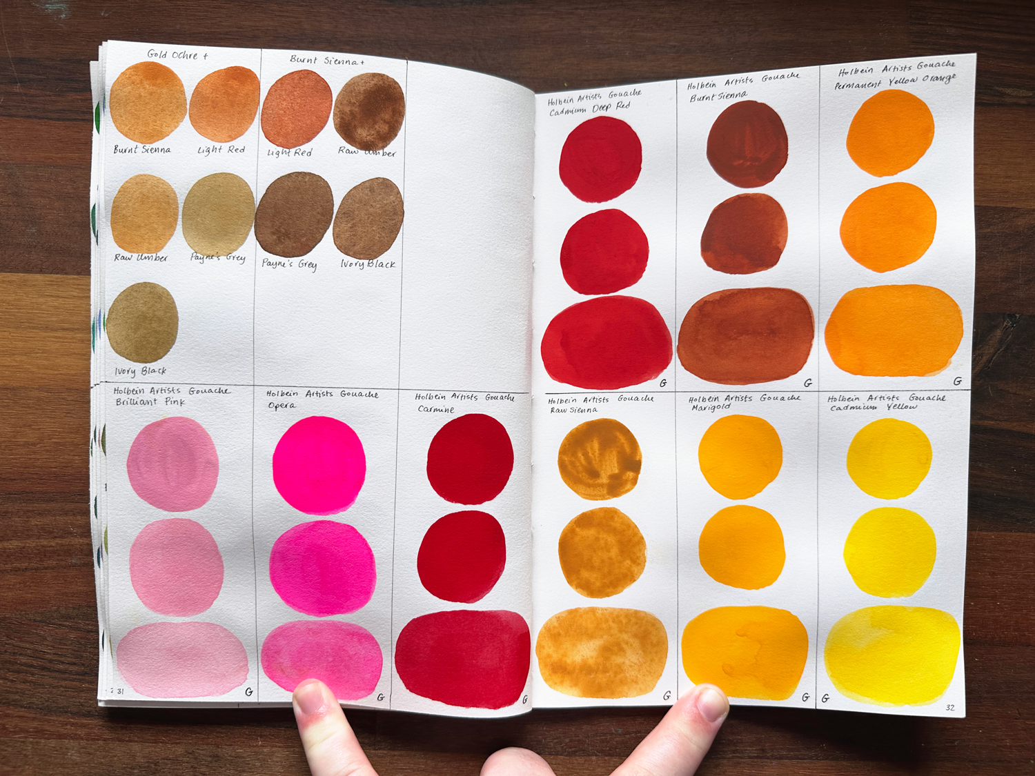
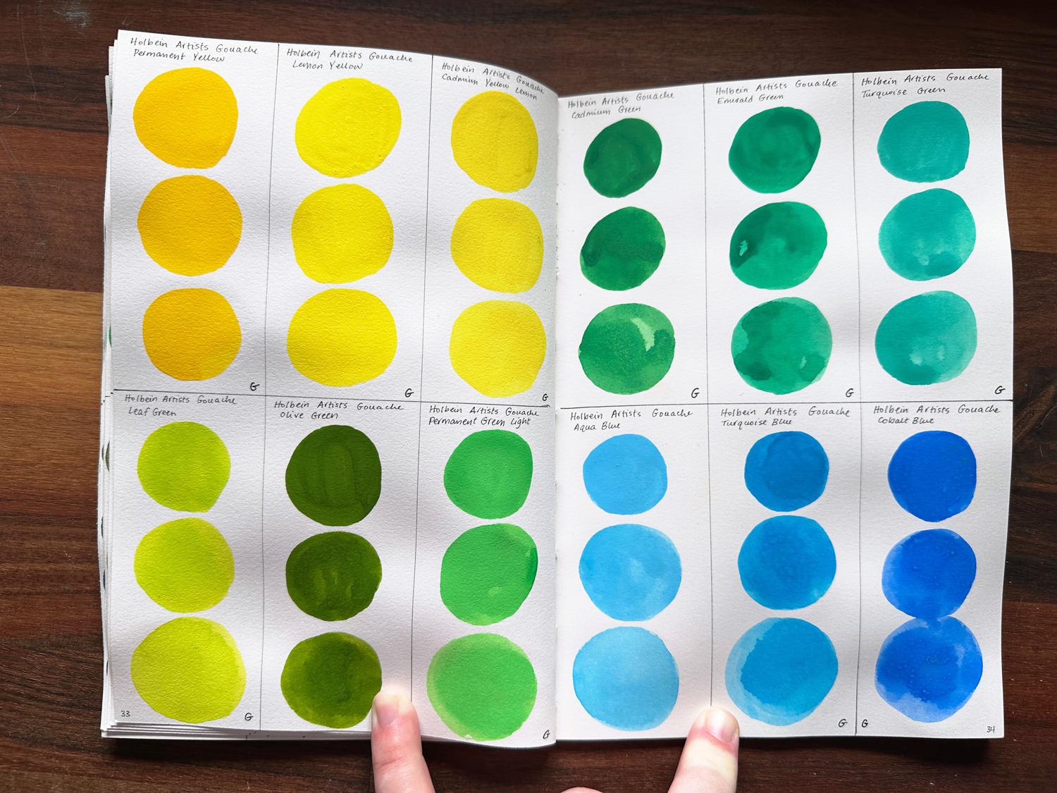
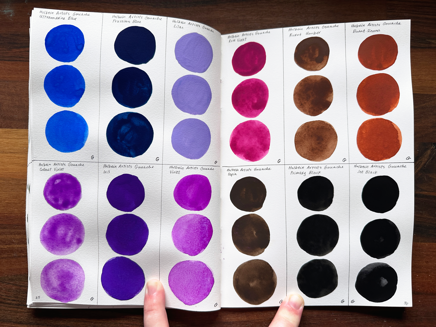
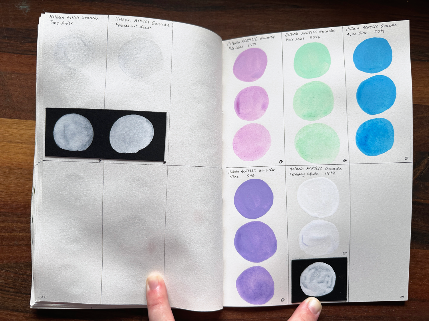
I love gouache. I have less experience with it than watercolors, and it can be a bit more finicky to work with in some ways, but I really enjoy it still! I’m really looking forward to getting more familiar with it again and using it in my work.
I haven’t had time to swatch these colors together just yet, but once I get around to it, I’ll be sure to upload those images here! For these initial swatches, like the watercolors, I did the initial swatch with three drops of water, then three more for the second, then three more for the final, but as you can see, for most of these, those extra drops had little to no impact! 😂 If I did this over again, I would significantly increase the number for each sequential swatch to get an actual variation in them.
Also, I did experiment with a limited color palette of the Acryla gouaches from Holbein, but I just… don’t like using acrylic paints all that much. I like that I can reuse the artists gouache later in a watercolor like way instead of having to scrape off the dried bits of acrylic gouache. It’s very unlikely that I’ll have more of those in the future, in case you were wondering!
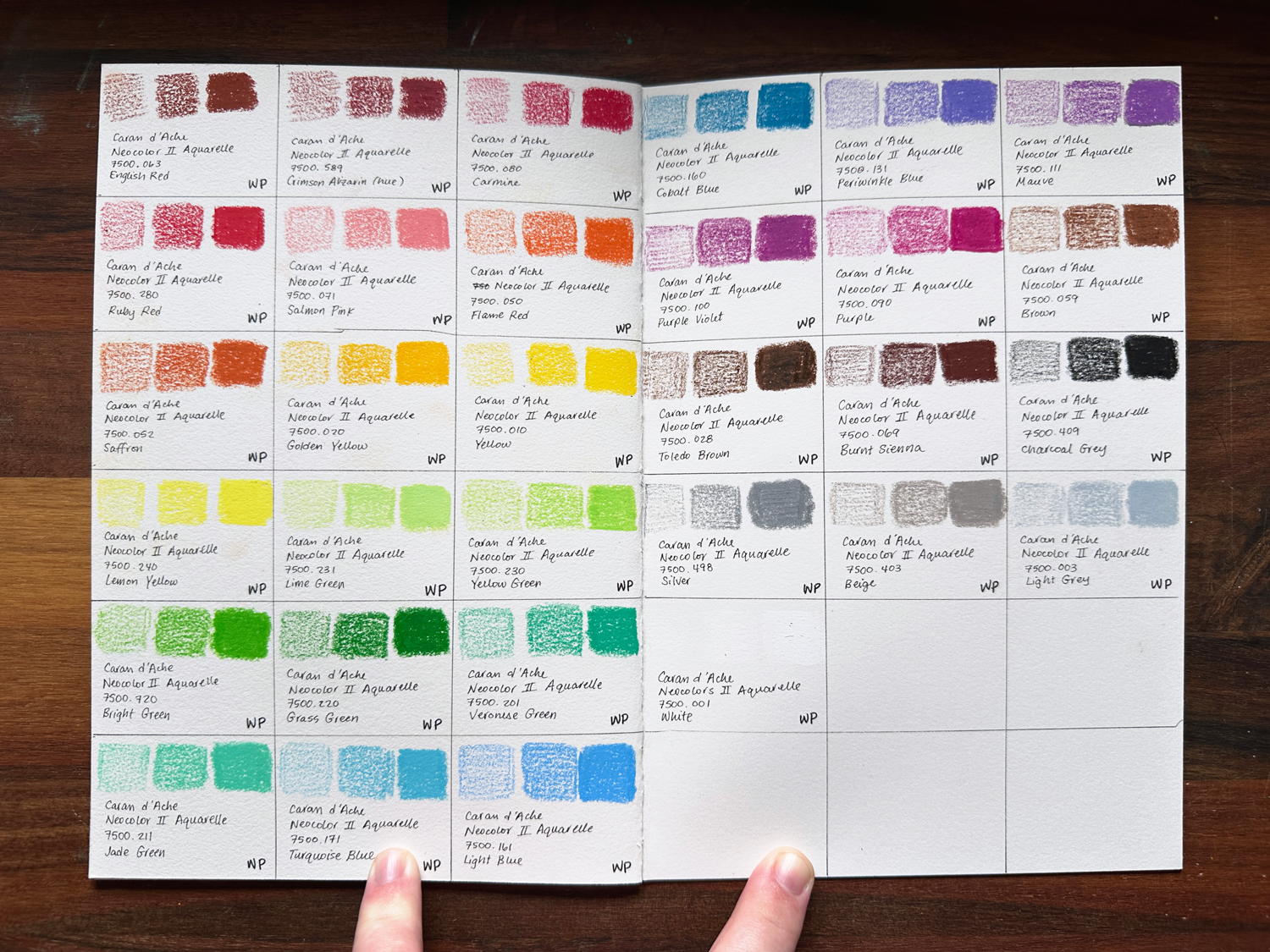
Neocolors II
The Neocolors II are newer to me than most of these other materials, but they also feel extremely familiar and intuitive to use since they’re basically professional crayons, my coloring tool of choice as a child 😂 It makes it really fun to work with on top of the paintings I’ve used it for so far.
These are also a bit water-soluble, but since I use them for the texture they bring a piece, I don’t use them that way. I also feel like my actual paints do a better job at painting lol.
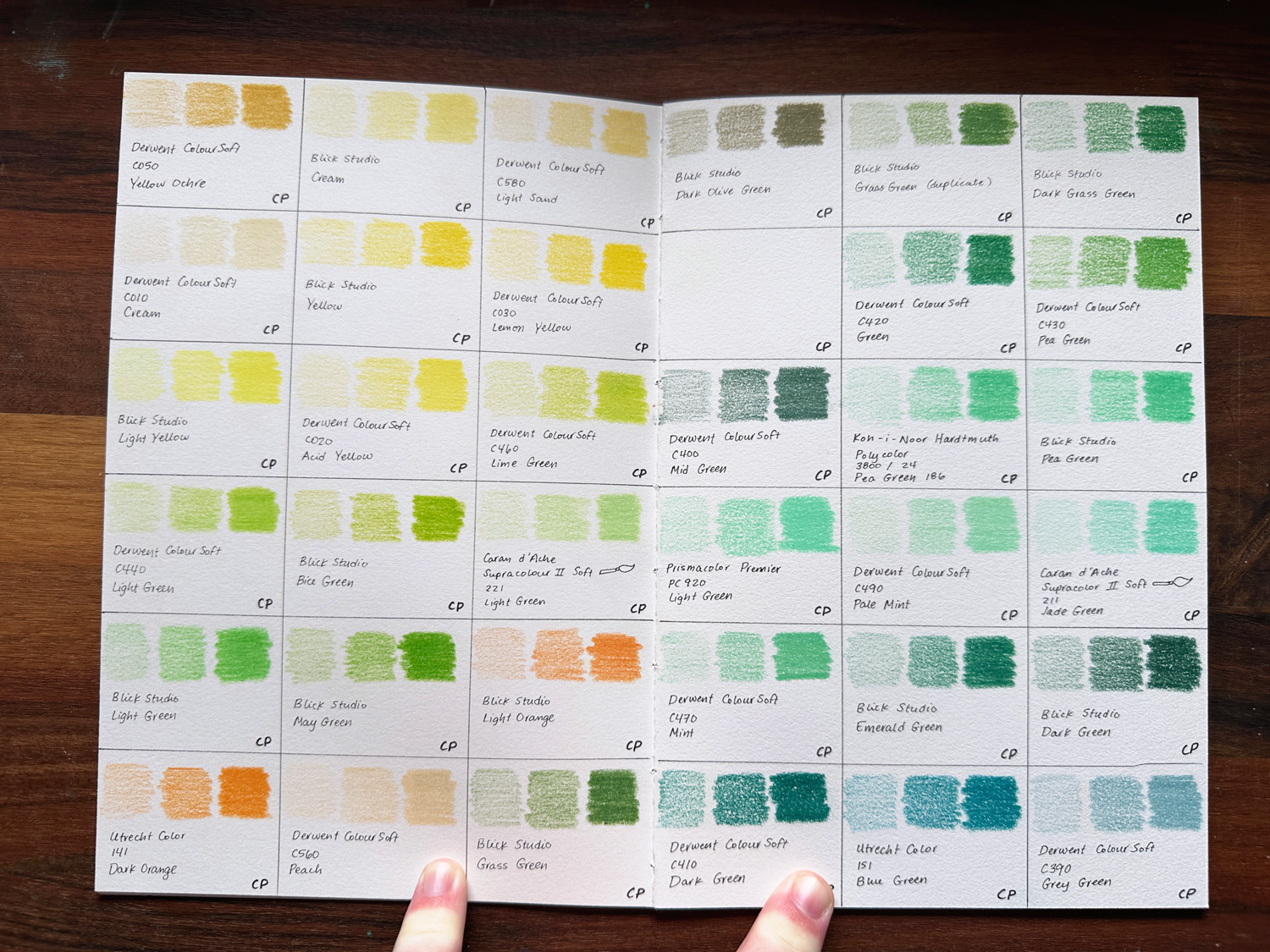
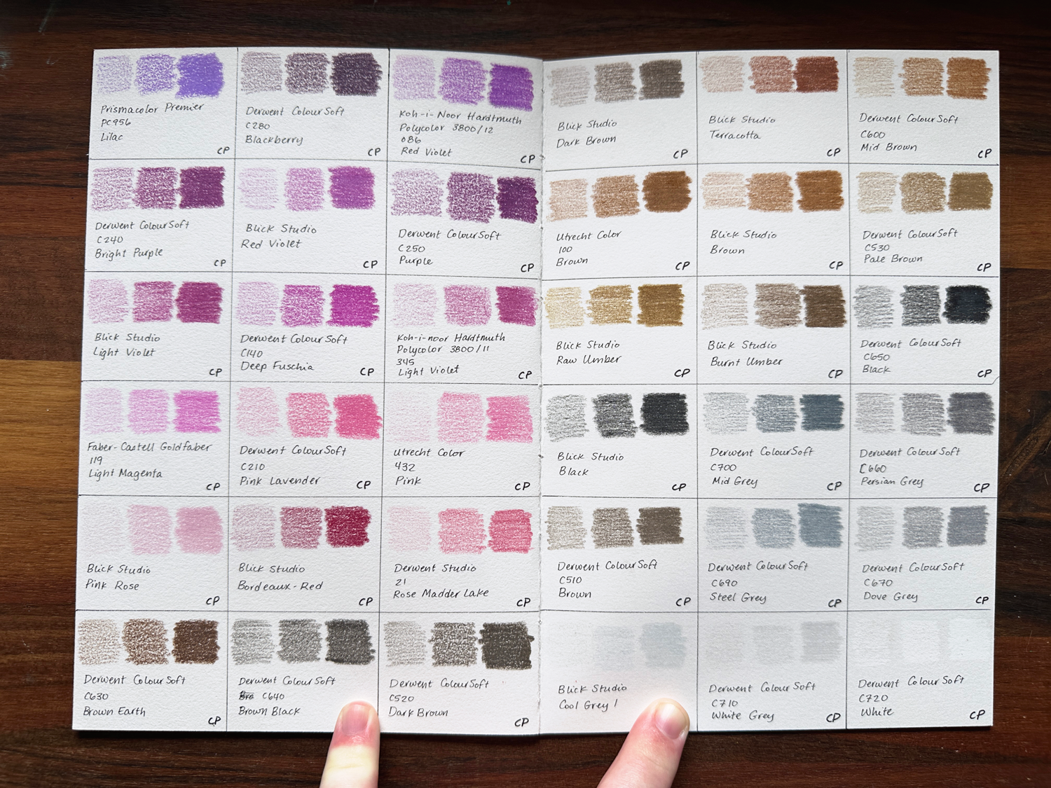
Colored Pencils
Ahhh, colored pencils. Truly so versatile! I tend to favor using a Blick Studio Pink colored pencil when sketching, but I love having a variety of colors for finishing touches and final art works. I really love the quality of the Derwent ColourSoft pencils because they go down so smooth, and I really like Blick’s variety of colors and affordability while remaining lightfast.
For each color, I swatched it pressing lightly, pressing firmly, and pressing hard to see the range of textures and color opacity/pigment concentration. And while the majority of these are Blick Studio or Derwent ColourSoft, I have to say I absolutely LOVE the Koh-I-Noor pencils and was super bummed that I couldn’t buy them individually for years. But as of 2025, this looks like it’s available as an option again, so I may pick some of my favorites of those up again and swatch them later.
I’m also a really big fan of the Caran d’Ache pencils, but they’re pretty pricey for me, so I get a few favorites here and there and stick to the others for a lower price range lol. ALSO, one of my pencils fell to the ground while swatching, and I keep forgetting to add it to the book, hence the blank spot in the greens section lol. All that to say, check back on this post occasionally to see if I’ve updated anything.


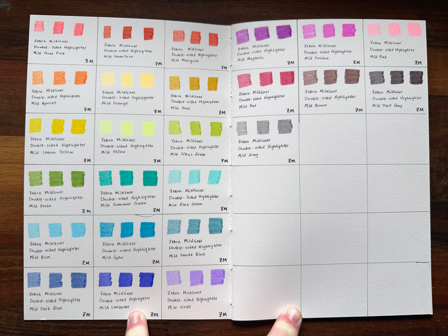
Zebra Mildliners
I will say, I got these mildliners primarily to work with my comic scripts! I really benefit from using color-coding to keep track of pretty much everything in my life. I use it so extensively that multiple people in the Co-op, my offline friends, and even my therapist have started calling the digital color palette I use to do this “the Jessi palette” 😂
What can I say? When I know what works for me, it gets put to work! 😂
So when I needed to keep track of multiple characters and props in a comic script, I knew that I would need to color code them, too! These are the Zebra Mildliner Double-sided Highlighters, which have a chisel tip on one side and a fine tip on the other side. For each color, I swatched them with one layer (left), two layers (center), and three layers (right).
Soft Pastels
I only just picked this set of soft pastels up for working on my comic Burden with– literally two days before writing up this post lol. I did a very brief swatch of a few of the colors the night I got them, but they’re SO DUSTY AND SMUDGY (which is why I bought them 😂)! I did a test to see what would happen when the colors were on opposing pages and pressed together, and sure enough, they started to rub off on each other, muddying the swatches up a bit. I want to swatch them properly, but I think I want to create a dedicated swatch book just for them first. I’d like to include, say, some wax paper or parchment paper in between to keep the swatches relatively clean.
I will say, though, that if you’re here for understanding what the colors will look like on the paper compared to in the box, rest assured! These are pretty much exactly the same as they appear in the box because soft pastels are basically pure pigment with a bit of binder material. That being said, I’ll be sure to share photos of the swatches here once I get those done!
I’m very much looking forward to incorporating these into my work regularly– although I think I better invest in a good fixative soon! 😂
Full List of Colors
Use the tabs to navigate to the material you're interested in!
- Blick Studio: Carmine
- Derwent ColourSoft: Deep Red (C130)
- Derwent ColourSoft: Red (C120)
- Derwent ColourSoft: Rose (C100)
- Blick Studio: Scarlet Red
- Blick Studio: Carmine Red
- Derwent ColourSoft: Scarlet (C110)
- Derwent ColourSoft: Mid Terracotta (C620)
- Derwent ColourSoft: Blush Pink (C180)
- Blick Studio: Vermilion
- Derwent ColourSoft: Blood Orange (C090)
- Derwent ColourSoft: Pimento (C540)
- Derwent ColourSoft: Bright Orange (C080)
- Blick Studio: Indian Red
- Blick Studio: Peach
- Blick Studio: Crimson Lake I
- Derwent ColourSoft: Pink (C190)
- Derwent Studio: Pink Madder Lake (17)
- Blick Studio: Blush Pink
- Derwent ColourSoft: Soft Pink (C170)
- Prismacolor: Light Peach (PC927)
- Caran d'Ache SupraColour II Soft: Salmon (051)
- Prismacolor: Peach (PC939)
- Blick Studio: Light Peach
- Blick Studio: Salmon Pink
- Blick Studio: Orange
- Blick Studio: Orange Yellow
- Derwent ColourSoft: Orange (C070)
- Blick Studio: Light Orange
- Utrecht Color: Dark Orange (141)
- Blick Studio: Cadmium Orange
- Derwent ColourSoft: Peach
- Blick Studio: Beige
- Blick Studio: Burnt Ochre
- Derwent ColourSoft: Ochre (C590)
- Utrecht Color: Naples Yellow (141)
- Blick Studio: Canary Yellow
- Blick Studio: Dark Yellow
- Derwent ColourSoft: Deep Cadmium (C040)
- Derwent ColourSoft: Yellow Ochre (C050)
- Derwent ColourSoft: Light Sand (C580)
- Derwent ColourSoft: Cream (C010)
- Blick Studio: Yellow
- Derwent ColourSoft: Lemon Yellow (C030)
- Blick Studio: Cream
- Blick Studio: Light Yellow
- Derwent ColourSoft: Acid Yellow (C020)
- Derwent ColourSoft: Lime Green (C460)
- Derwent ColourSoft: Light Green (C440)
- Blick Studio: Bice Green
- Caran d'Ache SupraColour II Soft: Light Green (221)
- Blick Studio: Light Green
- Blick Studio: May Green
- Blick Studio: Dark Olive Green
- Blick Studio: Grass Green
- Dark Grass Green
- Derwent ColourSoft: Green (C420)
- Derwent ColourSoft: Pea Green (C430)
- Derwent ColourSoft: Mid Green (C400)
- Koh-I-Noor Hardtmuth Polycolor: Pea Green (24)
- Blick Studio: Pea Green
- Prismacolor Premier:Light Green (PC920)
- Derwent ColourSoft: Pale Mint (C490)
- Caran d'Ache SupraColour II Soft: Jade Green (211)
- Derwent ColourSoft: Mint (C470)
- Blick Studio: Emerald Green
- Blick Studio: Dark Green
- Derwent ColourSoft: Dark Green (C410)
- Utrecht Color: Blue Green (151)
- Derwent ColourSoft: Grey Green (C390)
- Faber-Castell Polychromos: Cobalt Green (9201-156)
- Derwent ColourSoft: Sea Green (C380)
- Faber-Castell Goldfabe: Light Cobalt Turquoise (154)
- Blick Studio: Azure Blue
- Koh-I-NoorHardtmuth Polycolor: Ice Blue (15)
- Blick Studio: Ice Blue
- Blick Studio: Sky Blue
- Derwent ColourSoft: Blue (C330)
- Blick Studio: Light Blue)
- Koh-I-Noor Hardtmuth Polycolor: Light Blue (18)
- Derwent ColourSoft: Electric Blue (C320)
- Blick Studio: Phthalo Blue
- Derwent ColourSoft: Baby Blue (C340)
- Derwent ColourSoft: Iced Blue (C350)
- Blick Studio: Mountain Blue
- Derwent ColourSoft: Pale Blue (C370)
- Derwent ColourSoft: Ultramarine (C290)
- Utrecht Color: Cobalt Dark (141)
- Blick Studio: Ultramarine Light
- Blick Studio: Cobalt Blue
- Blick Studio: Dark Blue
- Blick Studio: Permanent Blue
- Blick Studio: Prussian Blue
- Derwent ColourSoft: Prussian Blue (C310)
- Blick Studio: Indigo Blue
- Derwent ColourSoft: Indigo (C300)
- Blick Studio: Delft Blue
- Blick Studio: Windsor Violet
- Blick Studio: Blue Violet
- Derwent ColourSoft: Royal Purple (C270)
- Blick Studio Permanent Violet
- Blick Studio: Violet
- Faber-Castell Goldfaber: Purple Violet (136)
- Prismacolor Premier: Parma Violet (PC1008)
- Caran d'Ache SupraColour II Soft: Periwinkle Blue (131)
- Derwent ColourSoft: Bright Lilac (C260)
- Prismacolor Premier: Lilac (PC956)
- Derwent ColourSoft: Blackberry (C280)
- Koh-I-Noor Hardtmuth Polycolor: Red Violet (12)
- Derwent ColourSoft: Bright Purple (C240)
- Blick Studio: Red Violet
- Derwent ColourSoft: Purple (C250)
- Blick Studio: Light Violet
- Derwent ColourSoft: Deep Fuschia (C140)
- Koh-I-Noor Hardtmuth Polycolor: Light Violet (11)
- Faber-Castell Goldfaber: Light Magenta (119)
- Derwent ColourSoft: Pink Lavender (C210)
- Utrecht Color: Pink (432)
- Blick Studio: Pink Rose
- Blick Studio: Bordeaux-Red
- Derwent Studio: Rose Madder Lake (21)
- Derwent ColourSoft: Brown Earth (C630)
- Derwent ColourSoft: Brown Black (C640)
- Derwent ColourSoft: Dark Brown (C520)
- Blick Studio: Dark Brown
- Blick Studio: Terracotta
- Derwent ColourSoft: Mid Brown (C600)
- Utrecht Color: Brown (100)
- Blick Studio: Brown
- Derwent ColourSoft: Pale Brown (C530)
- Blick Studio: Raw Umber
- Blick Studio: Burnt Umber
- Derwent ColourSoft: Black (C650)
- Blick Studio: Black
- Derwent ColourSoft: Mid Grey (C700)
- Derwent ColourSoft: Persian Grey (C660)
- Derwent ColourSoft: Brown (C510)
- Derwent ColourSoft: Steel Grey (C690)
- Derwent ColourSoft: Dove Grey (C670)
- Blick Studio: Cool Grey I
- Derwent ColourSoft: White Grey (C710)
- Derwent ColourSoft: White (C720)
- Holbein Artists Gouache: Brilliant Pink (G510)
- Holbein Artists Gouache: Opera (G584)
- Holbein Artists Gouache: Carmine (G502)
- Holbein Artists Gouache: Cadmium Deep Red (G505)
- Holbein Artists Gouache: Burnt Sienna (G603)
- Holbein Artists Gouache: Permanent Yellow Orange (G522)
- Holbein Artists Gouache: Raw Sienna (G601)
- Holbein Artists Gouache: Marigold (G532)
- Holbein Artists Gouache: Cadmium Yellow (G523)
- Holbein Artists Gouache: Permanent Yellow (G520)
- Holbein Artists Gouache: Lemon Yellow (G526)
- Holbein Artists Gouache: Cadmium Yellow Lemon (G524)
- Holbein Artists Gouache: Leaf Green (G540)
- Holbein Artists Gouache: Olive Green (G546)
- Holbein Artists Gouache: Permanent Green Light (G541)
- Holbein Artists Gouache: Cadmium Green (G543)
- Holbein Artists Gouache: Emerald Green (G545)
- Holbein Artists Gouache: Turquoise Green (G554)
- Holbein Artists Gouache: Turquoise Green (G554)
- Holbein Artists Gouache: Aqua Blue (G570)
- Holbein Artists Gouache: Turquoise Blue (G561)
- Holbein Artists Gouache: Cobalt Blue (G563)
- Holbein Artists Gouache: Ultramarine Light (G564)
- Holbein Artists Gouache: Prussian Blue (G566)
- Holbein Artists Gouache: Lilac (G587)
- Holbein Artists Gouache: Cobalt Violet (G583)
- Holbein Artists Gouache: Iris (G586)
- Holbein Artists Gouache: Violet (G581)
- Holbein Artists Gouache: Rose Violet (G588)
- Holbein Artists Gouache: Burnt Umber (G604)
- Holbein Artists Gouache: Sepia (G600)
- Holbein Artists Gouache: Primary Black (G658)
- Holbein Artists Gouache: Jet Black (G607)
- Holbein Artists Gouache: Zinc White (G631)
- Holbein Artists Gouache: Permanent White (G796)
- Holbein ACRYLA Gouache: Pale Lilac (D121)
- Holbein ACRYLA Gouache: Pale Mint (D076)
- Holbein ACRYLA Gouache: Aqua Blue (D099)
- Holbein ACRYLA Gouache: Lilac (D118)
- Holbein ACRYLA Gouache: Primary White (D194)
- Caran d'Ache Neocolor II Aquarelle: English Red (063)
- Caran d'Ache Neocolor II Aquarelle: Crimson Alizarin (hue) (589)
- Caran d'Ache Neocolor II Aquarelle: Carmine (080)
- Caran d'Ache Neocolor II Aquarelle: Ruby Red (280)
- Caran d'Ache Neocolor II Aquarelle: Salmon Pink (071)
- Caran d'Ache Neocolor II Aquarelle: Flame Red (050)
- Caran d'Ache Neocolor II Aquarelle: Saffron (052)
- Caran d'Ache Neocolor II Aquarelle: Golden Yellow (020)
- Caran d'Ache Neocolor II Aquarelle: Yellow (010)
- Caran d'Ache Neocolor II Aquarelle: Lemon Yellow (240)
- Caran d'Ache Neocolor II Aquarelle: Lime Green (231)
- Caran d'Ache Neocolor II Aquarelle: Yellow Green (230)
- Caran d'Ache Neocolor II Aquarelle: Bright Green (720)
- Caran d'Ache Neocolor II Aquarelle: Grass Green (220)
- Caran d'Ache Neocolor II Aquarelle: Veronese Green (201)
- Caran d'Ache Neocolor II Aquarelle: Jade Green (211)
- Caran d'Ache Neocolor II Aquarelle: Turquoise Blue (171)
- Caran d'Ache Neocolor II Aquarelle: Light Blue (161)
- Caran d'Ache Neocolor II Aquarelle: Cobalt Blue (160)
- Caran d'Ache Neocolor II Aquarelle: Periwinkle Blue (131)
- Caran d'Ache Neocolor II Aquarelle: Mauve (111)
- Caran d'Ache Neocolor II Aquarelle: Purple Violet (100)
- Caran d'Ache Neocolor II Aquarelle: Purple (090)
- Caran d'Ache Neocolor II Aquarelle: Brown (059)
- Caran d'Ache Neocolor II Aquarelle: Toledo Brown (028)
- Caran d'Ache Neocolor II Aquarelle: Burnt Sienna (069)
- Caran d'Ache Neocolor II Aquarelle: Charcoal Grey (409)
- Caran d'Ache Neocolor II Aquarelle: Silver (498)
- Caran d'Ache Neocolor II Aquarelle: Beige (403)
- Caran d'Ache Neocolor II Aquarelle: Light Grey (003)
- Caran d'Ache Neocolor II Aquarelle: White (001)
- Bronze Green Deep (158)
- Reseda Grey Green (212)
- Raw Sienna (508)
- Bistre (61)
- Mummy (104)
- Flesh Ochre (16)
- Yellow Ochre (115)
- Van Dyck Brown (439)
- Van Dyck Violet (409)
- Forest Green (915)
- Apple Green (205)
- Nickel Yellow (901)
- Lemon Yellow (603)
- Lemon Yellow (600)
- Naples Yellow (99)
- Cadmium Yellow Light (297)
- Bright Yellow (341)
- Golden Ochre (127)
- Golden Ochre (127)
- Red Brown (6)
- Lawn Green (150)
- Madder Violet (310)
- Magenta Violet (944)
- Purple Violet (325)
- Vermilion (83)
- Orange Lead (37)
- Helios Red (681)
- Chinese Vermilion (791)
- Van Dyck Violet (406)
- Hot Brown (191)
- Ivory Black (513)
- Blue Grey Green (500)
- Prussian Blue (288)
- Cerulean Blue (621)
- Ultramarine Deep (388)
- Cobalt Blue (353)
- Cobalt Blue (356)
- Cerulean Blue (257)
- Viridian (256)
- Viridian (252)
- Sennelier L'Aquarelle: Rose Opera (659) Series 2
- Sennelier L'Aquarelle: Carmine (635) Series 3
- Sennelier L'Aquarelle: Perylen Brown (499) Series 3
- Winsor & Newton Professional: Winsor Red (Series 1)
- Sennelier L'Aquarelle: Scarlet Laquer (612) Series 2
- Sennelier L'Aquarelle: Red Orange (640) Series 3
- Sennelier L'Aquarelle: Sennelier Yellow Deep (579) Series 1
- Winsor & Newton Professional: Naples Yellow (Series 1)
- Winsor & Newton Professional: Winsor Yellow (Series 1)
- Sennelier L'Aquarelle: Sennelier Yellow Light (578) Series 1
- Holbein Artists' Watercolor: Cadmium Yellow Lemon (W040) Series C
- Holbein Artists' Watercolor: Permanent Green No. I (W066) Series A
- Sennelier L'Aquarelle: Phthalo. Green Light (805) Series 1
- Holbein Artists' Watercolor: Emerald Green Nova (W064) Series B
- Winsor & Newton Professional: Cobalt Green (Series 4)
- Holbein Artists' Watercolor: Bamboo Green (W078) Series B
- Sennelier L'Aquarelle: Sennelier Green
- Sennelier L'Aquarelle: Hooker's Green
- Winsor & Newton Professional: Hooker's Green (Series 1)
- Sennelier L'Aquarelle: Sap Green (819) Series 1
- Sennelier L'Aquarelle: Forest Green (899) Series 1
- Sennelier L'Aquarelle: Phthalocyanine Turquoise (341) Series 2
- Sennelier L'Aquarelle: Phthalocyanine Blue (326) Series 1
- Sennelier L'Aquarelle: French Ultramarine Blue (314) Series 2
- Holbein Artists' Watercolor: Peacock Blue (W301) Series A
- Holbein Artists' Watercolor: Cobalt Turquoise Light (W106) Series D
- Daniel Smith Extra Fine Watercolors Premium Art Grade: Cobalt Teal Blue
- Holbein Artists' Watercolor: Horizon Blue (W104) Series A
- Holbein Artists' Watercolor: Lilac (W117) Series A
- Winsor & Newton Professional: Ultramarine Violet (Series 2)
- Holbein Artists' Watercolor: Permanent Violet (W115) Series B
- Sennelier L'Aquarelle: Red Violet (905) Series 3
- Holbein Artists' Watercolor: Cobalt Violet Light (W110) Series F
- Sennelier L'Aquarelle: Raw Sienna (208) Series 1
- Sennelier L'Aquarelle: Burnt Umber (202) Series 1
- Holbein Artists' Watercolor: Yellow Ochre (W034) Series A
- Sennelier L'Aquarelle: Gold Ochre (257) Series 1
- Holbein Artists' Watercolor: Burnt Sienna (W134) Series A
- Holbein Artists' Watercolor: Light Red (W130) Series A
- Holbein Artists' Watercolor: Raw Umber (W131) W131) Series A
- Holbein Artists' Watercolor: Payne's Grey (W156) Series A
- Sennelier L'Aquarelle: Ivory Black (755) Series 1
- Double-sided Highlighter: Coral Pink
- Double-sided Highlighter: Vermillion
- Double-sided Highlighter: Marigold
- Double-sided Highlighter: Apricot
- Double-sided Highlighter: Orange
- Double-sided Highlighter: Gold
- Double-sided Highlighter: Lemon Yellow
- Double-sided Highlighter: Yellow
- Double-sided Highlighter: Citrus Green
- Double-sided Highlighter: Green
- Double-sided Highlighter: Summer Green
- Double-sided Highlighter: Blue Green
- Double-sided Highlighter: Blue
- Double-sided Highlighter: Cyan
- Double-sided Highlighter: Smoke Blue
- Double-sided Highlighter: Dark Blue
- Double-sided Highlighter: Lavender
- Double-sided Highlighter: Violet
- Double-sided Highlighter: Magenta
- Double-sided Highlighter: Fuschia
- Double-sided Highlighter: Pink
- Double-sided Highlighter: Red
- Double-sided Highlighter: Brown
- Double-sided Highlighter: Dark Gray
- Double-sided Highlighter: Gray